Thinkific mobile app launch

My role on the project

I was the fourth and final designer on the project, and I arrived for the Closed Alpha stage.

I was responsible for launching both Thinkific mobile app and Creator branded mobile app products, creating consistency from the multiple designers it had been through. I also tackled UX and UI for the launch, as well as advocating for follow-up improvements.

On launch day, over 1000 Creators adopted the Thinkific mobile app feature, and users who could not afford a Branded app solution were thrilled to hear that they could use the Thinkific app for free, as part of their plan.

The Thinkific app hit the Top Charts (in the #30's) on the App Store, ahead of our B2B competitors, and even some other learning adjacent apps like Khan Academy and Coursera.

We currently have a 4.7 star rating on the App Store (Aug 2023).

What's Thinkific?

Thinkific is a B2B SaaS platform offering online courses and communities for a broad range of industries, accessible to students through a web app in the browser. Unlike open marketplace-style apps like Skillshare, Coursera, and Masterclass, Thinkific is more like an island (similar to Shopify or Squarespace).

The mobile app was the highest ranked feature on our public roadmap. 🔥

Based on our company vision, we knew that our Creators really wanted their own branded app, customized with their own logo and name. We actually offer this service for a high monthly fee. The Thinkific branded app, on the other hand, would be available to all paid plans at no additional cost, with the trade-off that their Learners would know about Thinkific.

We had to launch the app very quickly, since two of our direct competitors already had a mobile app channel, and some Creators were leaving Thinkific or not choosing the platform because of this.

User Personas for the Thinkific Branded App

A student holding a smart phone, smiling

Learner

Our app's primary user is the person who consumes content.

Based on our interviews, Learners were eager and passionate to learn about the courses they purchased.
They are adult-improvers.

Their reasons for wanting an app:

1. Scenario-based learning
Though they prefer to learn on desktop, they want an app for various scenarios like playing a video or listening to audio in the car while driving, going for a walk, or doing multi-tasking with housework at home.

2. Ease of access
They also find value in using Thinkific's Community interactions for mobile, like reading and quickly replying to post discussions.

A woman holding a laptop with company growth metrics behind

Creator Educator

We have several different customers from all industries, but for the Thinkific mobile app is for the Creator who doesn't want to pay the high monthly fee for their own Branded app. They may also be getting started in their online teaching journey.

Their reasons for adopting a generic Thinkific mobile channel:

1. To offer a companion app to the current learning experience on desktop

2. To communicate with their students more easily, so that student engagement, course completion, and retention are higher

The problem: Learners couldn't find their schools.

Meet the dreaded subdomain screen.

As soon as users arrived on this page, it felt like a dead end. The term "subdomain" was too technical for both Learners and Creators.

Most of our Creators have a custom domain. For example, they didn't want their Learners to know they were using Thinkific, so they had schools like "www.nightphotography.com" instead of "www.nightphotography.thinkific.com."

Dynamic links partly solved the issue

Our team tried Dynamic Links, which allowed us to skip the generic school search screen. Each Creator receives their own unique school storefront page URL that they can share with their students (see image on the right).

In addition, Dynamic Links work across app installs: if a Learner opens a Dynamic Link on iOS or Android and doesn't have the Thinkific app installed, the Learner can be prompted to install it; then, after installation, the app starts and the Learner can access this screen.

Because Dynamic Links were a new concept, about half of our Creators and Students simply didn't use them and went straight to the app store to download the Thinkific app. This was due to their existing mental model. They'd see the subdomain screen and get stuck.

Also, we couldn't rely only on Dynamic Links alone. They worked well for the beginning of the user journey, but sometimes the app would sign the user out, and they were taken back to the subdomain page, rather than this custom sign in page.

I evaluated the direct competition

Our competitors had a better login design experience.

All a Learner had to do was enter their email and/or password.

After authentication, the app would log the student into all of the schools (from multiple Creators) they were enrolled in.

That solution was too expensive and complex for us to build at the time. We had to look within our own system capabilities and find a timely solution.

We also noticed when we tested one of our competitors' apps, that the login wasn't working, and it was confirmed with several negative app reviews.

I explored 3 more lo-fi solutions

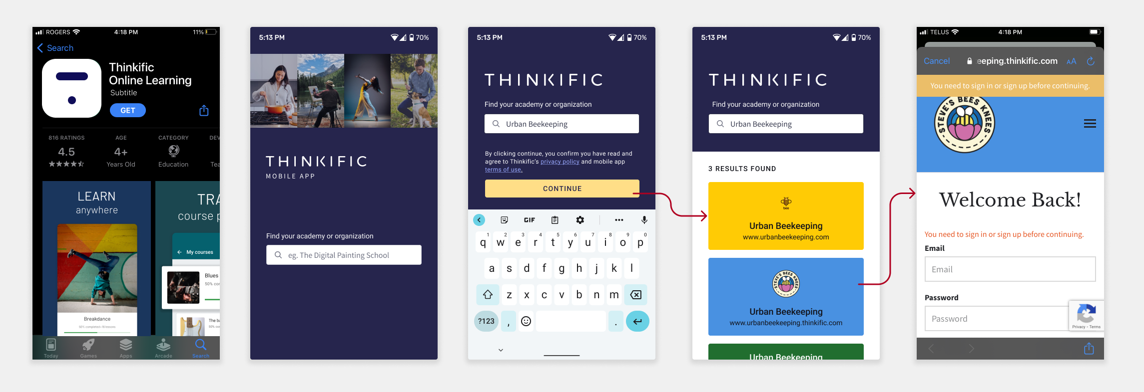
Solution 1: A school search, where Learners could type in the name of the school or keywords (if they couldn't remember the full name). A list of results would appear.

Solution 2: Enter the school's domain, which ensures only 1 unique result.

Solution 3: The Learner enters their email, and they have to check their email to find out which schools have the mobile app enabled, then they would get logged into the one school they clicked on.

wireframe of a user flow of a sign in flow

Decision-making & consulting stakeholders

Our back-end developer said that they could combine the first and second options. They were the easiest to implement, because the we could ask the database for the school name and custom domain name already. They couldn't do keywords specifically, but if the word was already in the school name or domain name, it would show up. The third solution was a little confusing and had a lot of room for error/ more variables to think about.

We showed this hi-fidelity mockup (image below) to Product Leadership and asked if this felt like we were encroaching on forbidden "marketplace" territory, like Skillshare and Udemy. They said no, because weren't actively encouraging a Learner to discover new schools. There was a chance that a Learner would click on the other schools out of curiosity, but the chances were slim, because our Researchers told us that Learners often buy from Creators they already know through social media.

User flow of the a user searching for their school and signing in

We were willing to make the trade off for a better user experience.

We implemented this version a sprint before the beta launch, and I personally followed up with our Learners to see how their experiences went. They said they were able to find their schools much easier. Success!

Rebrand explorations

We launched the app during a rebrand, so I changed the visual design of the screen to match the new look and feel of Thinkific. Marketing suggested that I use this mobile phone image, but I really wanted to convey that it was a platform of multiple Creators, rather than for one specific Creator.

design explorations for "find your school" screen

Final animation

Because of the small screen real estate, multiple Creator images became too busy.

I decided on using the design pattern of the last three screens and animated each Creator coming into the screen with After Effects.

I then used Lottie's Bodymovin plugin to export it as a .json file, which made handoff and development incredibly fast and easy.

Accessibility Testing

We also tested the accessibility usability score (AUS) of the app with real assistive technology users from a company called Fable.

We received an AUS score of 65 from a screenreader user. The average for this segment is 56.
We received an AUS score of 80 from a screen-magnification user. The average for this segment is 72.

Reflections

We didn't have much quantitative data to measure the impact of our changes, since we launched the changes during our closed Alpha group of 20 schools. I'm relieved that we focused on this crucial part of the flow before going live to all of our Creators, because 1000+ schools joined in the first week of launching the app.

Because we launched an MVP, we had a lot more features to add and bugs to fix.
Apple reviews fluctuated a lot, and we increased it to 4.7 stars as of August 2023.

If you'd like to learn more about this case study, feel free to send me an email request.

Check out the rest of my work.